Like many magicians, Andrea Veronese has never had a real corporate identity, nor a web marketing strategy for the acquisition of contacts. 100% of the salaries come from word of mouth and an excellent professional reputation built over many years of activity in the field of magical entertainment.
We will proceed by designing a real brand, creating an effective identity on the web and activating a web marketing campaign. We will see in the final conclusions of this article, how this strategy have obtained results absolutely out of the ordinary.
Branding
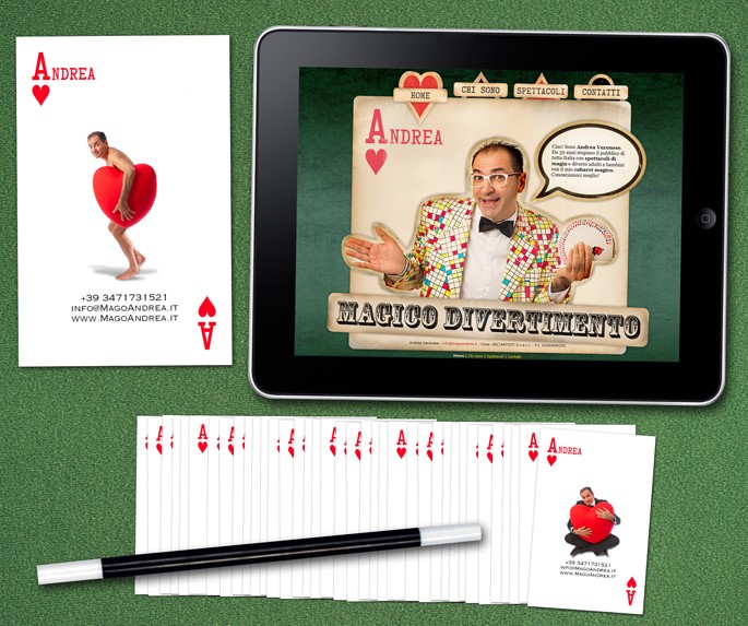
It is inevitable, centuries have passed but when we talki about magicians, the usual two clichés come to mind: playing cards and bunnies from the hat. So we will exploit them both, squeezing them to the last drop.
What is the most famous playing card in the world?
The ace of hearts obviously, so why not combine it with the name of our artist?
Both a business card and a promotional card have been created, often requested by the fans at the end of the show.
Since the verve and the sympathy of the character are very strong, all the branding has been centered on them using a photographic connotation.
Web Design
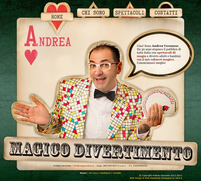
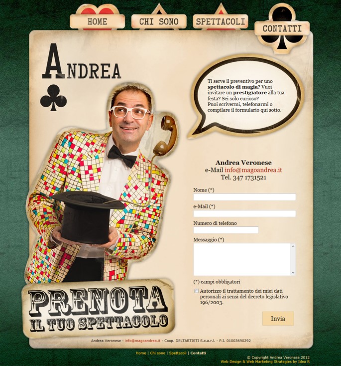
Andrea Veronese offers a wide selection of magic shows, but what characterizes them all is the cabaretistic soul and the bright colors.
We want to design a website that conveys its sympathy and experience. Let's see the results.
- The grunge style is very fashionable, but was chosen above all to give a circus and retro atmosphere, not wanting to overshadow the fun aspect of the artist.
- Even the home page payoff of the "Magic Fun", sums up very effectively that we are not just talking about amazement, but also about fun and laughter.
- Here too we used the playing card cliché, placing it on a green grunge cloth and declining it in the 4 aces corresponding to the 4 areas of the website.
- Since a large chunk of customers are interested in children's animation, we have given life to the website using jQuery animations and HTML5 technologies.
The goal we wanted to achieve was that the visitors do not bounce, a technical term that describes the case in which a visitor arrives on the Internet site and leaves immediately without looking at the other pages. To avoid this we have done a careful work of copywriting, cleverly alternating keywords, jokes and useful information.
The result has been achieved, in fact today the site has a very low bounce rate, less than 12%. But the most interesting data that pops out from our web analytics is that 75% of those who do not bounce then visit all the pages of the website. The merit as already underlined is the graphics but above all the effective alternation of humor and seriousness.
We must never lose sight of the purpose of the site being realized:
- it is useless to fill it with hundreds of photographs and videos that no one will ever look at;
- it is useless to write self-referential poems that no one will read and to whom no one will believe.
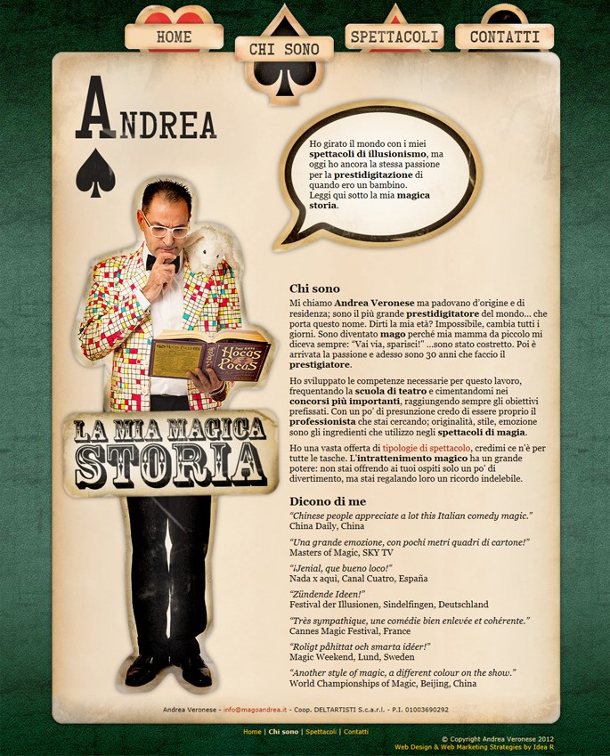
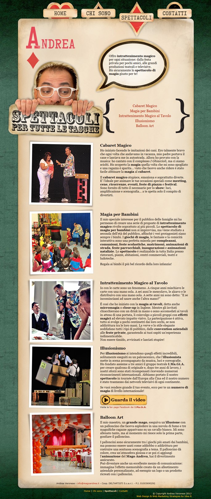
What we need to do is to concentrate in a few lines and images what the prospect wants to know:
- Who is the artist and what are his references (few but good)?
- What are the shows that offers (a few images and explanatory videos)?
- How can I contact him (a simple form to fill out)?
- Less is more.
Did you like this article up to here?
Before you continue, follow us on our LinkedIn page pressing the button here below!
In this way, we'll be able to keep you updated on digital strategies not only with our posts, but also with the best articles that we collect around the web.
Web Marketing
We have studied an SEA (Search Engine Advertising) campaign that increases the conversion rate of the website, using the following strategies and technologies:
- We have invested on the best keywords in the industry (there are many online tools that allow it to do so, for example Google Trends).
- We injected a lot of JavaScript and Google Analytics code that would allow us to study the behavior of visitors in depth, far beyond simply monitoring visits.
- We have created many self-sufficient landing pages, specifically targeted for each group of keywords.
- We have activated a lot of A/B/N tests on landing pages (using Google Optimize), to observe statistically which ones convert better and where to invest more.
Results
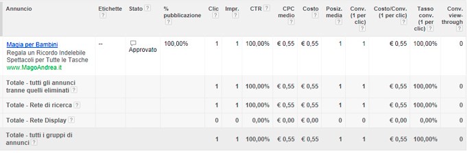
With a minimum daily investment, we get a CTR (Click-Through Rate)of 9.30%: it means that every 100 views of the ad, 9 people come to visit the website. Keep in mind that in western countries where we are very accustomed to advertising, having a CTR of 0.5% is already considered a success, here it is 20 times higher.
Beyond the visitors, does the site provide contacts?
I'll show you out of curiosity, taking it directly from Google AdWords, how the campaign started: the first time the ad was viewed (see the Impr. column), the first user who saw it clicked on it (see the Click column) and immediately afterwards filled in the contact form (see the Conv. column).
We'll let you imagine the rest ...

Do you like this blog?
For us your opinion matters, so we would be very pleased if you could write a review about us or our blog.