Since 1999 TAV Engineering
is fully dedicated to provide technical assistance and spare parts for vacuum
furnaces of any type and any brand.
The high qualified staff designs ad-hoc solutions and plans the best strategy
for vacuum furnace upgrades.
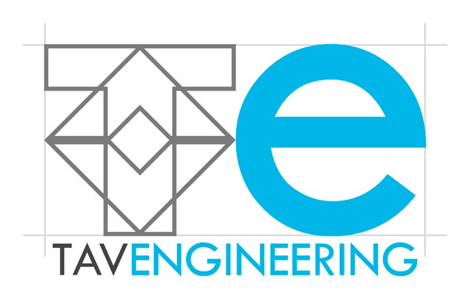
Dealing the company with after-sales services, we have created a brand that
keeps distance from the cold and aseptic image of the metal industry, focusing
instead on the human aspect: who's looking for technical support does not want
automatic telephone responders, but she is looking for a human contact, to
receive help, advice or just confirmations. This is why the letter "e" of TAVE
is made with a character that, with its pronounced roundness and symmetry,
recalls the shape of a smile.
To not lose the technological soul and to highlight the engineering approach to
problem solving, the brand is enclosed within four thin guidelines, that
resemble projects on tracing paper and highlight the extreme precision of the
graphics (and implicitly company services).
Finally, to make explicit the partnership with TAV, TAV Engineering
inherits part of the brand. In this case the brand TAV is restyled to become
transparent, signifying the company's ability to "look inside" TAV products (the
brand TAV recalls the shape of an oven).
The font used for the E of
TAVE, for the logotype and the corporate identity is the 20th Century™.
The 20th Century™ font was designed and drawn by Sol Hess between 1936 and 1947.
It is based on geometric shapes that originate in Germany at the beginning of
1920, that became an integral part of the Bauhaus movement of that time. The
clean cut, with no serifs and the precise geometric shapes make it appropriate
for the headlines and advertisements of
TAV Engineering.
Talking about color, the blue recalls the consistency, reliability and
intellect, very important values for
TAV Engineering.
Mapped to white, which is the preferred color for the background of the brand,
the blue reinforces the idea of purity and cleanliness, concepts associated with
the production with vacuum ovens.
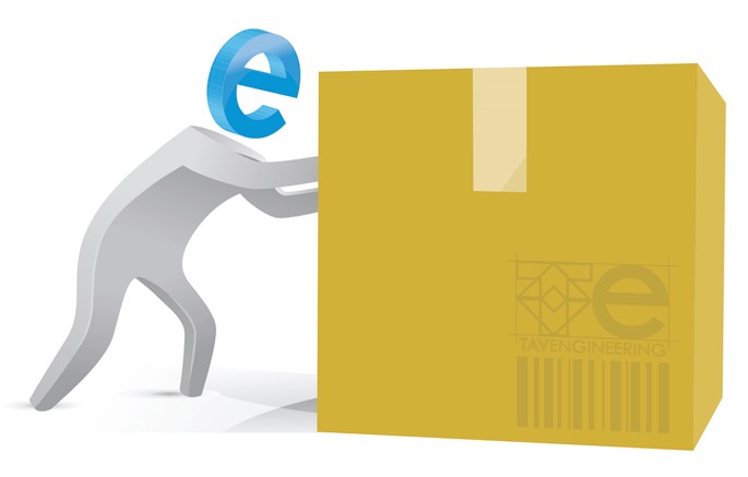
To further increase the emotional impact of the brand, emphasizing the human
and friendly aspect of the company, we have created various stylized mascots,
that instead of the face have an anthropomorphic smiling E.

Do you like this blog?
For us your opinion matters, so we would be very pleased if you could write a review about us or our blog.